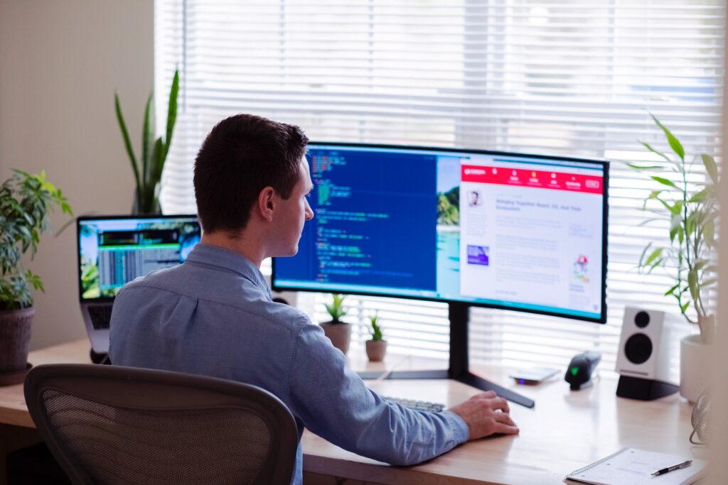
Web designs can only work if they receive equal inputs from designers and users. Website interactions can also act as a measurement of how engaging the pages are. An interactive web design works by engaging the user and compelling them to visit other pages, find more content, and ultimately click on the call to action (CTA) button.
Interactive designs should be user-oriented and offer them control while providing elements of personalization and playfulness. There are several benefits of including interactive designs on your website. Some of them are as follows:
- Help you connect better with your audience
- Improvise personalization of your website
- Lowers the bounce rate of your website
- Improves your brand awareness
- Encourages users to share your website
- Helps in building backlinks
- Increases your conversion rates from the website
So if you are looking for ways to make your web design more interactive, you can use some of these ideas or check out here.
Use Animations During the Screen Loading

Source: pexels.com
The screen loading time can be one of the biggest deterrents to a smooth web browsing experience. You might have put in a lot of money and effort to build a beautiful website. But if the web pages take more than 2 to 3 seconds to load, visitors can become impatient and may even leave.
You can utilize the screen loading time as an opportunity to hold the user’s attention using animations. You can also use them to impress your visitors, show off your brand, and excite visitors. The animations give the user a sense of progress before they can access the webpage.
You can also include games to play during the screen loading time to create a fun experience. The objective is to prevent the negative experience of the page loading time by transforming it into something positive.
Use Animated Scrolling to Organize Information
Scrolling through a website is probably the most usual and simplest interaction that visitors can have. But just because users do not think about scrolling on your website does not mean that you cannot instigate them. There are several ways in which you can use animated scrolling to provide dynamic movement on your web pages. These are some of the most common ones.
- The animation can be triggered when a visitor scrolls through your webpage. The effects can be magical when the visuals create the illusion of a webpage getting built in response to their action.
- You can use parallax or asymmetrical scrolling to engage your visitor’s attention. The feature makes two objects on the webpage move at different speeds when the user. It stimulates a 3D depth in the movement, especially when objects in the foreground scroll faster than the background.
- You can use scrolling page transitions in which a user can scroll down to the next part of a webpage, or a new one. You can also use it to create dramatic effects and introduce new page elements with different color schemes. It will make the user feel that they have reached a new website with every scroll.
These animations are not only interactive visual elements but also provide a well-defined hierarchy and organizational structure.
Use Carousels to Break Vertical Movements

Source: unsplash.com
Designers call them carousels because they introduce the content within rotating sections that visitors can cycle through. They are becoming extremely popular on websites as people get habituated to swiping on smartphones. They also provide a refreshing break from the monotony of vertical scrolling movements.
But that is not the only advantage of using carousels in website interaction. You can also use carousels and sliders to include more context on every section of the webpage. It allows you to show the necessary information without cluttering the page. You can collapse the content or segments into small-sized elements that visitors can scroll through one by one.
Use Questionnaires Instead of Forms
Entering information is one of the most boring parts of the website interaction. Forms also make visitors feel nervous about entering their information on websites. So instead of making the process feel like filling out a form at the hospital, you can transform it into a question-and-answer session.
It can be in the form of an interactive questionnaire where users can answer clearly phrased questions in personable ways. You can also use multiple-choice questions to reduce the interactive burden for a visitor. Try to make the questions appear one at a time so the users do not feel overwhelmed or discouraged.
Use Micro-Interactions

Source: ewa.org
The small movements can create the maximum difference in interactive web designs, especially when it comes to animations. The real purpose of animation on websites is often to provide feedback to the visitor. They let the users know whether they can interact with an element or not.
They also tell a user if they have clicked on the right section. You should realize that feedback provided by animations works best at a subconscious level. Larger animations can be distracting to users and overshadow their original purpose, especially for simple things like hovering over an element, closing a window, or clicking on icons.
Popular animations used for micro-interactions include turning the color of a button or putting a checkmark on an icon. Your goal should be to let the visitor know that they have successfully completed their intended action.
Interactive web designs can be one of the many reasons why visitors may decide to come back to your website. These interactions can turn the process of finding information into an experience. So do not let your website failed to capitalize through interactive web designs and get lost among the competition. You can use these ideas, and many more, to ensure that your visitors keep coming back to your website.


