It is not a secret that we are living in “the world of photos”. The popularity growth of social media is probably the main reason why something like that happened. Individuals want to share photos on their private social media accounts while businesses try to grab the attention of potential customers with some attractive visuals.
Logically, the second thing we mentioned above requires more time, energy, and creativity. It is not enough to take a picture of something, publish it, and wait for the results to come. You will have to edit every possible image you share on your website, social media, or anywhere else.
What does It take to Become a Good Photo Editor?
First of all – you need to get ready to work hard on your talents. The creativity raises together with determination. Despite that, you will have to improve your knowledge and learn how to work with different photo editing tools.
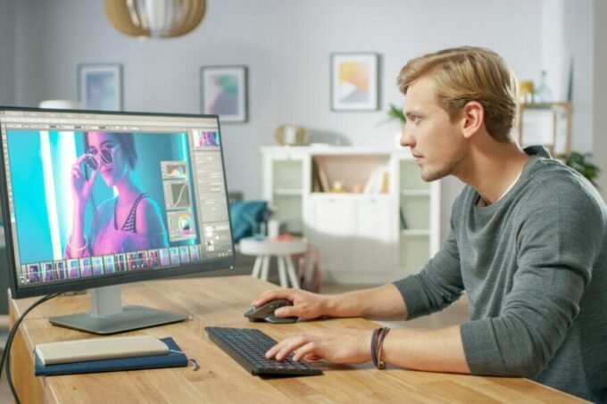
The next thing you need to ensure is good equipment. Before everything, the device you are working on needs to have strong graphics. That is the only way to see the tiniest details that potentially need editing. On the other hand, the mouse you use should be large enough to ensure comfortable work.
There are a lot of them, so you will have to read more about their features, compare them, and find the most appropriate ones.
With good equipment, talent, and creativity, you will manage to become a good photo editor. Yet, before you start your journey, you should know that photo editors are also people. More precisely, they also make some mistakes. Because of that, we would like to highlight some of the biggest mistakes they make and ensure that your progress goes in the right direction. Let’s find them out together!
1. Making Eyes Too Bright

Source: pexels.com
Yes, eyes should be the main subject that stands out in the photo. However, certain limits should exist because overdoing it is not going to bring the best result. By brightening the eyes too much, it may happen you make them look freaky and scary.
P.S. The same rule counts when we talk about both, animals and people.
2. Making the Teeth Too White
Despite eyes, a smile is another element that should stand out in the photo. Photo editors often use different tools to whiten the teeth of the person on the image. However, just like in the previous case, it is not the point to overdo it.
Keep in mind that the photo needs to look natural. We would all like to have perfectly white teeth, don’t we? However, something like that is impossible. Instead of that, try to make the look of a person on the photography natural. If the teeth are the lightest element, then you can be sure there is something wrong.
3. Making Contrast Too High

Source: jeskabaileyphotography.com
Well, using contrasts is an excellent way to highlight some parts of the image and make it look more entertaining. However, that doesn’t mean the contrast should be too high. You may make the darkest spots of the image “too dark”. In that way, many details on your photography are going to be lost.
On the other hand, that also doesn’t mean you should make contrast low. In that case, the image may become drab or flat. Because of that, it is essential to make some sort of balance that won’t harm the quality of the entire photo. You may want to use different detail-oriented methods to remove or add contrast. In that way, everything will probably look just fine.
4. Using Different Color Tones
Getting out of the box is sometimes necessary. In that way, you will manage to make your photography unique and different from the mass of others. Despite that, it will also help you to confirm your expertise. Many people that do the same thing as you will decide on matching different colors. However, that type of risk will not pay off if you are using color tones that are not matchable.
There is one additional piece of advice that we can provide you with here. If you want to split the color tones, you should know how to edit the highlights as well as all shadow colors. However, these two processes should be separated.
All the color tones need to match each other. However, with bad equipment, noticing these details may not be possible. That is the reason why you should not hesitate to spend a bit more money (especially if you plan to become a professional).
5. Keeping a Wrong Aspect Ratio

Source: windowsreport.com
It is not the point to make the image claustrophobic. Of course, the subject of the photo should not be 10 meters away from the camera. However, that doesn’t mean it should be the only thing people can see in the image.
Don’t over-crop the images, and be sure to ensure a good aspect ratio. You can use the so-called rule of third that many photo editors are using as well. When editing, create two horizontal and vertical lines. In that way, you will divide the entire image into nine equal rectangles. Thanks to those rectangles, you will easily manage to make a perfect aspect ratio.
6. HDR? Use It, But Not Too Much
As you probably know, HDR is an acronym for High Dynamic Range. The range of the highlights and shadows is dynamic on the images with this effect. However, if you overdo it, there is a big chance some elements of your photography are going to become too white. On the other hand, the dark side of the image will be “too dark”. In both cases, you can be sure your photography is not going to be eye-pleasing.
Final Thought
Noticing details without good equipment is going to be impossible. Despite that, purchasing a good mouse that will ensure comfortable work is a must-do thing. However, even if you invested a lot of money, you won’t boost the quality of your photos if you don’t respect the rules from this list.
To conclude, whichever effect you are using, you need to be sure you are not overdoing it. A balance needs to exist because that is the only way to make the image look amazing. Over time, you will manage to develop your own editing style and split from the mass of other editors. In other words, sooner or later, you will become successful!


