If you are reading this article, you’re probably struggling with a bounce rate that’s too high. Well, you’re in the right place because on this page, we’ll share some tips and tricks that will help your bounce rate go down.
As you probably know, a high bounce rate is the main reason why you’re not getting conversions. If most of your visitors aren’t spending enough time on your page, you won’t be able to turn them into returning customers. So keep on reading to find out how to decrease your bounce rate.
1. Provide an Excellent

The user experience is the most important factor when building and optimizing a web page. When creating your website, whether you use a website builder such as Wix or a custom one, the user experience should always come first.
Monitor the actions of your users to figure out where they spend the most time and where they end their sessions. And more importantly – test, test and test even more! Maybe your users are leaving your website because they land on a broken page. You’ll never know until you test!
2. Speed Up Your Website

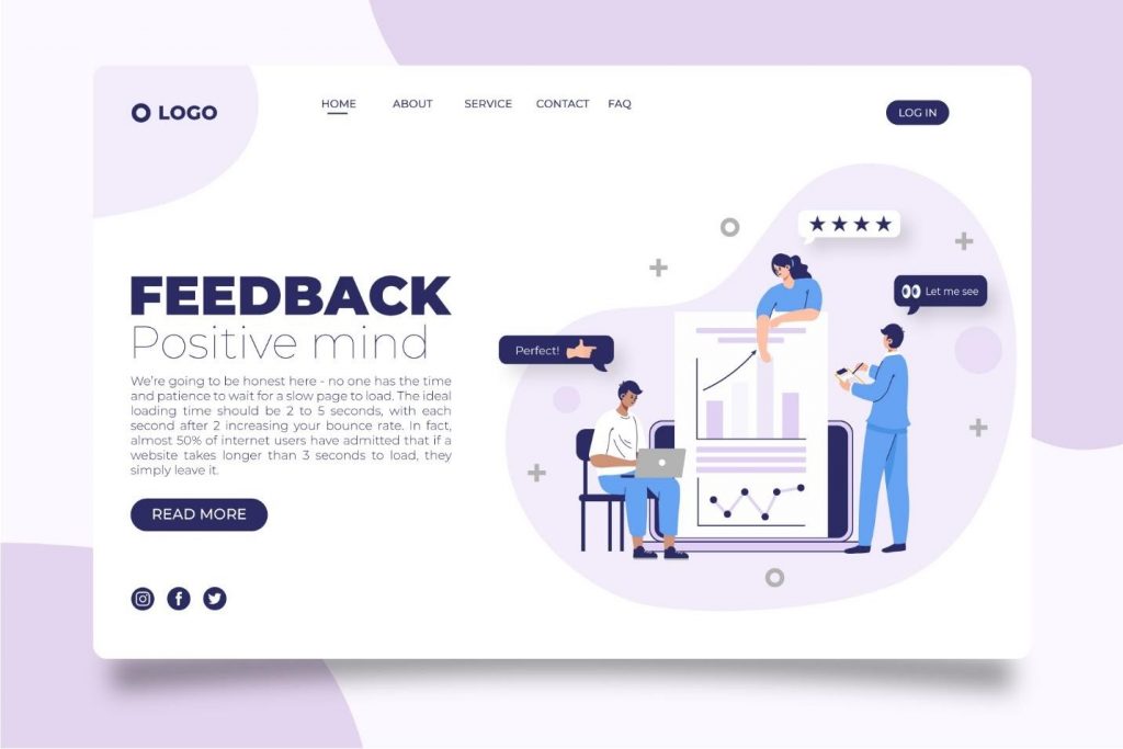
We’re going to be honest here – no one has the time and patience to wait for a slow page to load. The ideal loading time should be 2 to 5 seconds, with each second after 2 increasing your bounce rate. In fact, almost 50% of internet users have admitted that if a website takes longer than 3 seconds to load, they simply leave it.
You can use tools such as Google Page Speed to check and optimize your website’s loading speed. But there are also some things you can do on your own such as compressing the images, using a CDN (Content Delivery Network) and choosing a fast hosting service.
3. Keep Your Visitors Engaged

If your users keep leaving your website, maybe they’re just not entertained enough. To boost user engagement and interaction, you can use videos. They’re even better at grabbing – and holding – attention than images and they can help you decrease your bounce rate significantly.
However, video footage can be quite expensive. But don’t worry – good images are just as great. You’ve surely seen how so many websites are using high-quality pictures as backgrounds. And the reason they do that is because this tactic has been proven to work. Companies such as Google or Facebook are often using this strategy to create beautiful landing pages with low bounce rates.
4. Build Credibility

Nowadays, it’s easy for a customer to do a thorough research on websites and shops before buying. And if they find even the smallest flaw in your credibility, they will immediately abandon ship. New customers are especially hard to convince – no matter how great your products or services are, they have no prior experience and thus, no way of personally assessing quality.
So if you have glowing reviews from previous customers, display those. Proudly showcase any awards, certifications, quality scores, endorsements and relevant affiliations. Make sure your website is as safe and secure as possible and display those safety seals as well. All of these elements will come together and build a reputation that will not only attract new customers but keep the old ones loyal as well.
5. Make Your Content Readable
A common reason behind a high bounce rate might be the readability – or lack thereof – of your content. To be more specific, if your website is littered with huge chunks of text, this might scare away the users. And to take it even further, how is that content formatted?
Often, the text layout makes it hard to read, even if you split everything into separate paragraphs. Keep in mind to always keep the headline separate, add subheadings and even use bullet points to explain any other benefits worth noting.
6. Don’t Disrupt the UX

We’re talking about pop-ups here. You know we’re all about being honest here so here it goes – pop-ups are annoying. They disrupt the user interaction and too many of them can make your website a pain to go through. And as you’ve learned earlier, nobody has the patience for that.
We recommend avoiding pop-ups entirely. But if you must add them, make sure to keep them as relevant and non-intrusive as possible. When they’re well-designed and placed, they can even help you grow your user base. For example, if you own an online shop, a good pop-up is the one where you announce discounts for users who sign up to your newsletter.
7. Up Your Call-to-Action Game
Your visitors won’t know what you want from them unless you tell them. It’s that simple. A good call-to-action can make or break both your bounce rate and your conversions. So make sure you have a compelling CTA, one that will stir the curiosity of your users and make them want to find out more about your website.
You might think that something as little as changing the small text on a button won’t make a difference but trust us, once you optimize your CTAs, you will notice the difference. Good calls-to-action will improve usability, along with the time users spend on your page. And more time on the page means a lower bounce rate!
In Conclusion
A small bounce rate means that your website is actually offering something of value to your users. It means they’re engaged with your content and enjoy spending time on your page. So you can see why lowering your bounce rate matters – a high bounce rate, especially on your homepage should be alarming. It means that your users aren’t interested in what you have to say and they leave within the first few seconds.
We hope our suggestions will help you greatly lower your bounce rate and drive user engagement. Because, as we all know, better user engagement means better conversions. And the more conversions you have, the faster your business grows!


