Design, like everything else, takes time to learn and master. It is said that every part of the process is a learning curve, and figuring out solutions for problems that are yet to arise. As you already know, during the wireframing process, the designers try to establish the flow and the structure of the solutions by creating draw overviews of the interactive products. All these things can easily reflect the needs of the brand as well as the needs of the customers.
They are mainly used to create prototypes that are user-focused and overall optimal for the organizations. If you want to master your design skills, you have come to the right place. Here, we are going to talk about the role of low-fidelity wireframes in design exploration and we are going to help you glide through the innovative beginnings of your design journey.
Why Do We Need to Take a Step Back and Explore the Low-Fi Wireframes?
In a world dominated by screens, where virtual interfaces drive our every interaction, the foundation of these digital creations starts with something surprisingly rudimentary: wireframes. Imagine trying to erect an architectural marvel without a blueprint, or a painter attempting a masterpiece without a rough sketch.
The outcome would be chaotic at best. In the realm of web and app creation, low fidelity wireframes play the part of these essential blueprints, providing a skeleton structure that guides the way forward.
These wireframes, often termed ‘low-fi’, aren’t about polished looks or intricate details. Their simplicity is their strength. Representing the bare bones of a sketch, they focus solely on functionality, layout, and the user journey. Think of them as the pencil sketches in an artist’s pad, hinting at the grandeur to come, but fluid enough to allow for exploration and change. This stage of drawing is where the magic of innovation truly happens.
How Can These Solutions Guide and Improve Your Design Process?

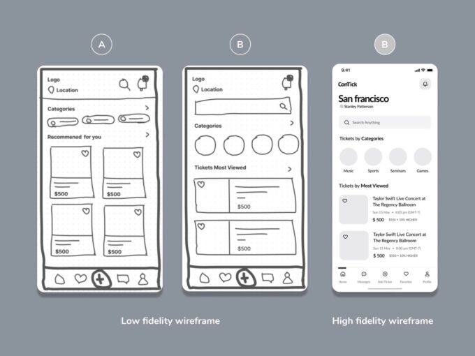
Source: mockplus.com
One might wonder why, in an age of high-tech tools and software, there’s a need to go back to basics with low-fi wireframes. The truth lies in their unmatched agility. During the early stages of a sketching process, there are bound to be countless revisions, multiple brainstorming sessions, and numerous feedback rounds. A detailed, intricate design would make this phase cumbersome, slow, and counterproductive.
As you can see on zenframe.com, low fidelity wireframes, on the other hand, act as a navigational compass. They are easily adjustable, allowing designers to quickly iterate, incorporate feedback, and experiment with different layouts without getting bogged down by minute details.
This approach promotes a collaborative environment where ideas can be shared freely, feedback can be seamlessly integrated, and decisions can be made swiftly. It’s a sandbox for designers, a place to test out different pathways, see what works and what doesn’t, and chart the best course forward.
Why Do You Need to Be Flexible With Your Ideas in the Early Design Stages?
Low-fi wireframes can be equated to clay in a sculptor’s hands—malleable, adaptable, and ripe for shaping. This flexibility is crucial in the initial stages of sketching. It allows for risk-taking. Designers aren’t deterred by the potential need to redo hours of intricate work. Instead, they are encouraged to try out-of-the-box layouts, play with unconventional user flow, or even challenge existing drawing norms.
Moreover, by stripping down a sketch to its most elemental form, stakeholders can focus on what truly matters: the user experience. Without the distractions of color schemes, detailed graphics, or typography, discussions can center around the user’s journey, the placement of elements, and the overall functionality. This phase ensures that when the time comes to add those finer details, the foundation is solid, intuitive, and user-centric.
It Is a Tool That Can Help Improve Your Collaboration

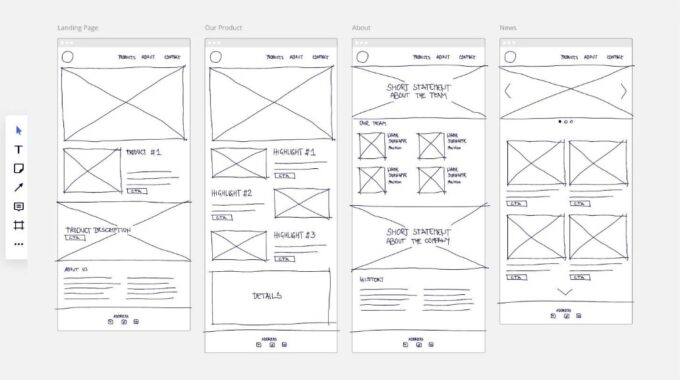
Source: activecollab.com
Beyond just a sketch tool, low fidelity wireframes serve as a bridge between designers, stakeholders, and even potential users. Their simplicity cuts through the jargon, making them accessible to those who might not have the proper background. This inclusivity ensures that feedback is comprehensive and diverse.
Incorporating a wide range of perspectives at this foundational stage can lead to a more holistic end product. It minimizes the risk of tunnel vision, where a design team might be too close to a project to see potential pitfalls or areas of improvement. By democratizing the feedback process, low-fi wireframes ensure that the final sketch isn’t just aesthetically pleasing, but also intuitive, functional, and aligned with user needs and expectations.
These Solutions Can Aid in Making the Right Decisions
While the visible aspects of creation often garner the most attention, the underlying choices are where the real decisions are made. It’s within the framework of low fidelity wireframes that creators tackle critical challenges, pondering over the placement of a button or the flow of a user journey.
These seemingly minor choices can make or break a user’s experience. For instance, a misplaced call-to-action can result in lost conversions, while intuitive navigation can enhance user satisfaction manifold. Thus, delving into these wireframes isn’t just about understanding a design’s skeleton; it’s about comprehending the thought process, rationale, and strategic choices behind every element.
They Will Impact Your Final Outcome

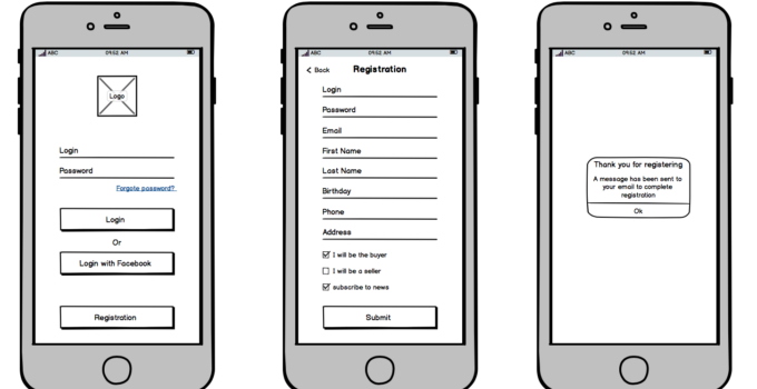
Source: miro.com
It’s fascinating to consider how initial decisions, taken during the low-fi wireframing phase, can echo throughout the entire development process. A well-thought-out wireframe can simplify subsequent design stages, reduce development time, and even streamline user testing.
Conversely, oversights at this stage can lead to increased revisions, stakeholder dissatisfaction, and potential usability issues down the line. It’s a testament to the ripple effect of early choices.
It underscores the importance of meticulous planning, foresight, and a deep understanding of user needs right from the get-go. In the intricate dance of development, the first steps, though simple, often determine the grace and fluidity of the entire performance.
In the complex labyrinth of the creative process, low fidelity wireframes are the guiding light. They represent the essence of drawing, stripped of frills, focusing solely on function and user experience. As the starting point of any digital project, they set the tone, guiding designers, facilitating collaboration, and ensuring a user-centric approach.
In the grand tapestry of creation, they might seem like a humble beginning, but as any seasoned designer will attest, they are the bedrock upon which digital masterpieces are built.
If you are interested in design, you may want to check our article guide on web design and learn something new along the way.


